
Building the guardrails for Virtual Card expiration experiences
July 2022 - March 2023
The goal: Equip users with the means to seamlessly replace their expiring virtual cards in a moment of spend disruption to avoid spend loss.
Capital One’s virtual cards provide a layer of security for users paying for shopping or bills online in an age of unprecedented online activity and information sharing. Functioning as a “mask” for their credit card account, users are able to pay for the things while keeping their primary account information private from the merchant. Like credit cards though, they do not last forever and have an expiration date.
I designed the currently-live virtual expiration experiences to help ensure users have the agency to replace their expiring virtual cards when needed. This effort fed into a product success of 533% growth in monthly active users by end of 2022 since the previous year.
Context + Driving Insights
In 2017, Capital One pioneered consumer-facing virtual card services, marking a distinct leap in digital banking. Now, from the moment a customer opened up a credit card with us online, they could begin to spend, before their physical card even came. Virtual cards are used anywhere from shopping online to paying recurring utility bills.
While I was not a part of the product launch 5 years prior, I came on board when it came time to tackle an unaddressed product lifecycle challenge: the absence of a virtual card expiration experience.
The business case for providing an card replacement flow is that virtual card spend saves Capital One money spent in fighting customer fraud and resolving (by curbing) fraudulent purchases.
Usage of one subset of virtual cards, known as merchant-specific virtual cards, alone decreased fraud cases for every 10k transactions. This was 60% lower than the measured instances where a involved their customer primary account number; that’s over half fewer fraud cases for business ops to resolve.
-
The savings captured by virtual cards had documented momentum as well—early reads suggested that overall VCN spend increased when a customer adopted more than one virtual card--for example, we saw a 10% increase in VCN usage after a user adopted virtual cards, especially merchant-specific virtual cards.
By the end of 2022, we knew we would have 3 out of the 4 virtual card product platforms scaled to over 95% of its customers. This means we knew sustained virtual card adoption and usage would require a holistic product and marketing strategy to support their growth.
We envisioned a two-part solution:
First, we had to effectively communicate and prompt our users to take action on a key task that impacts their finances.
Secondly, we then needed to introduce the capabilties to self-service, regardless of the user’s preferred virtual card platform, once they became aware.
Identifying the Gaps
When I joined, expirations were coming up within a month so we aimed to at least get the fundamental awareness messaging on our Virtual Card Manager (VCM) for web ASAP before anything else as it was the most heavily trafficked space our regular VCM users visited.
More critically, this is a space found within every eligible credit card customer’s CapitalOne online account and bound to expand to full at end of year. Unit the we could provide a “create” function in VCM web, the minimum let users know they needed to redirect to their Capital One Browser Extension (COBE) to create a new virtual card to replace the expiring one.

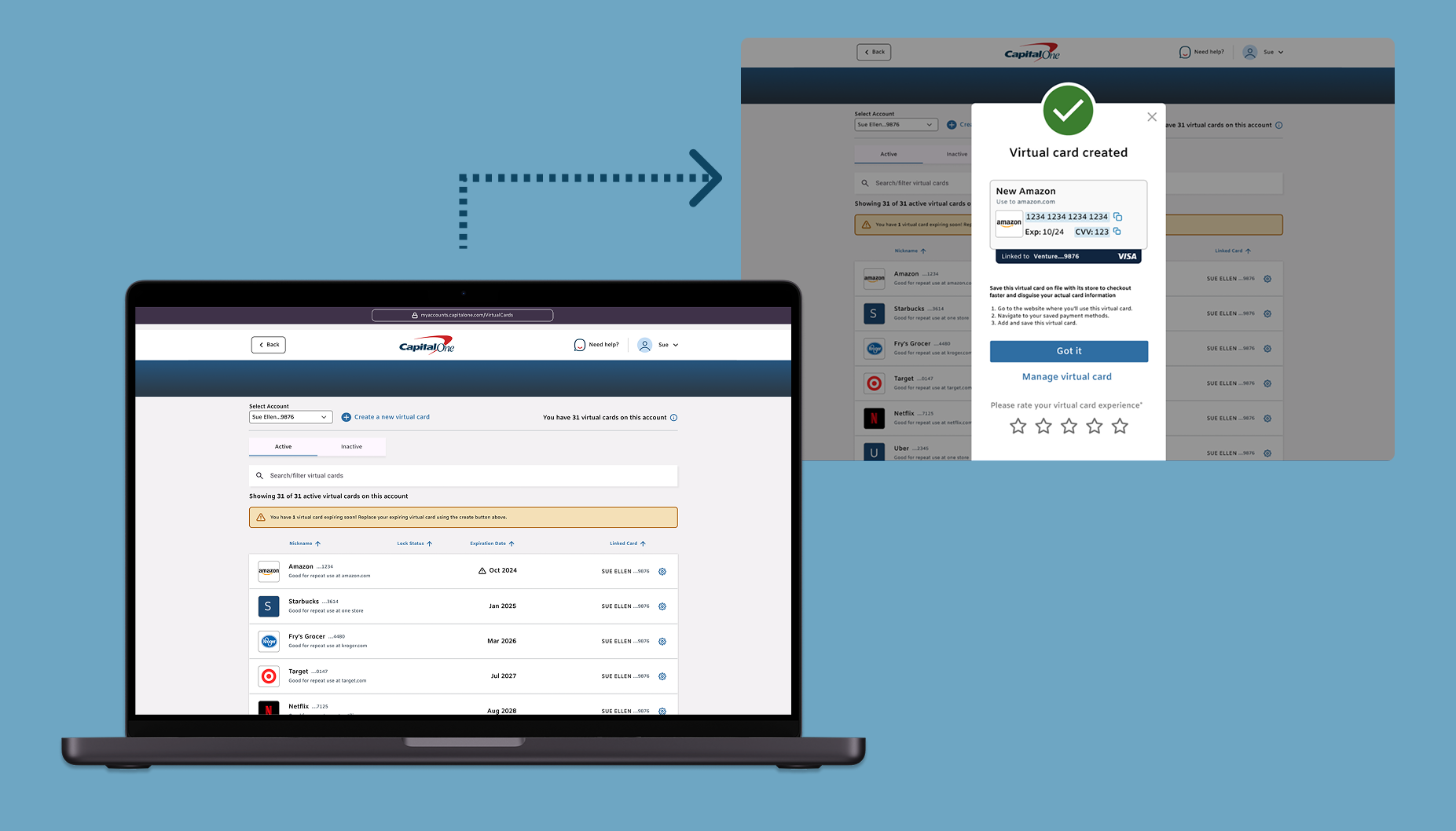
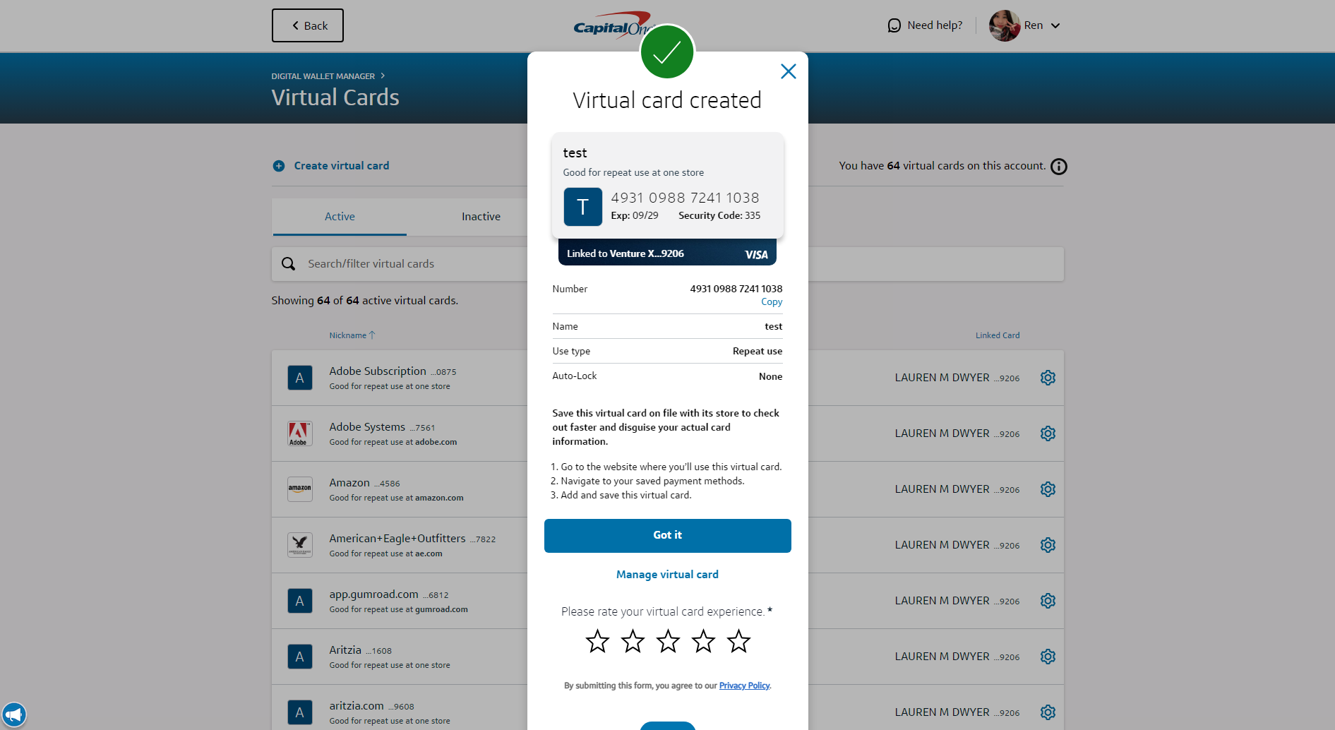
Initially, users were able to see their virtual cards in the VCM despite only being able to make new ones in the Capital One Browser Extension (formerly known as Eno) — once they got here from the expiration email alert, they needed to be able to know that they needed to replace their expiring ones using the extension.
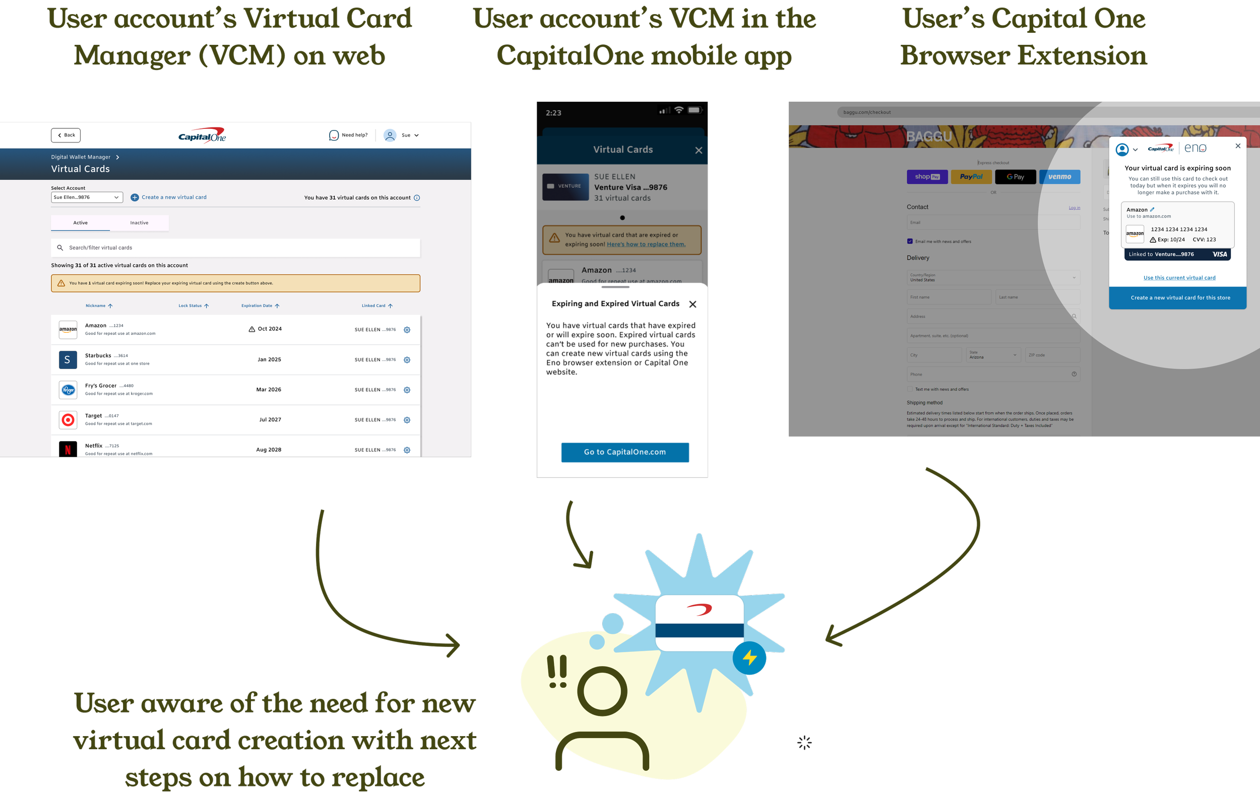
Updating the VCM web table with these dates was simple enough but how can we better anticipate the broader experience landscape and future needs? To answer this I mapped out the VCN renewal flows of the 3 main VCN channels to comprehensively see the existing gaps since there was no prior big-picture artifact.
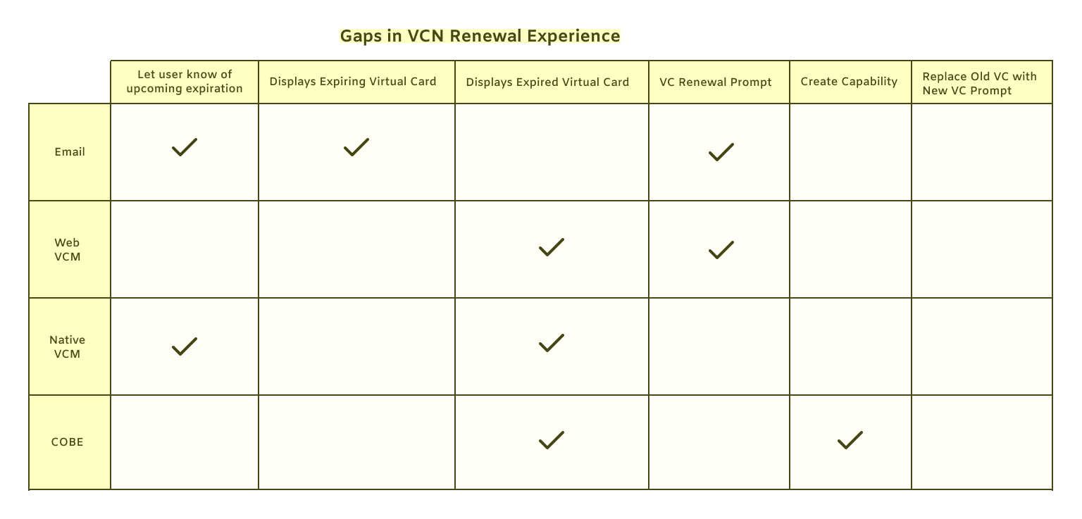
It’s clear that the communication we have with our users about their virtual cards is anything but that. While we let users know via email, they have a very frustratingly narrow means of renewing—while they all may have started off creating them using the COBE, they may have moved over to our web or native card manager experiences and are not be inclined to access an old product again.
Many users were only familiar with their virtual cards from the Capital One Browser Extension while others may access them directly from their Virtual Card Manager page while not being directly eligible for the create tool on the site quite yet. A third group could potentially first encounter these messages while on their phones in the app.
This mapping was helpful for identifying the current UX and UI gaps, which was easy to lose sight off between the multiple teams managing each of these spaces. This visualized the need for parity as a defining priority for the expiration work moving forward.
Designing for Consistency
Capital One provides several channels for users to access and manage their virtual cards. This meant expiration updates designs had to be considered across iphone/android, desktop or mobile web and the browser extension app.
First and foremost, a high-level in-line warning message was positioned as one of the first items a user could see on the VCM or BE page as it is a component that translates well across the various platforms. This lets them know that there are expirations coming, but to let them know which ones specifically needed treatment, warning icons would be attached on a per-card basis.
I worked with tech within regular refinements to ensure feasibility and to run any context-specific component deviations by them (such as hyperlinks within alert messages). Tech, legal and product approval were also needed for green-lighting the MVP design and message content given this relatively new situation.

The new in-browswer-extension expiration experience. Users still have the choice to continue using their old one, but creating the new one is effortless and does not require a re-direction since it has create capabilities.
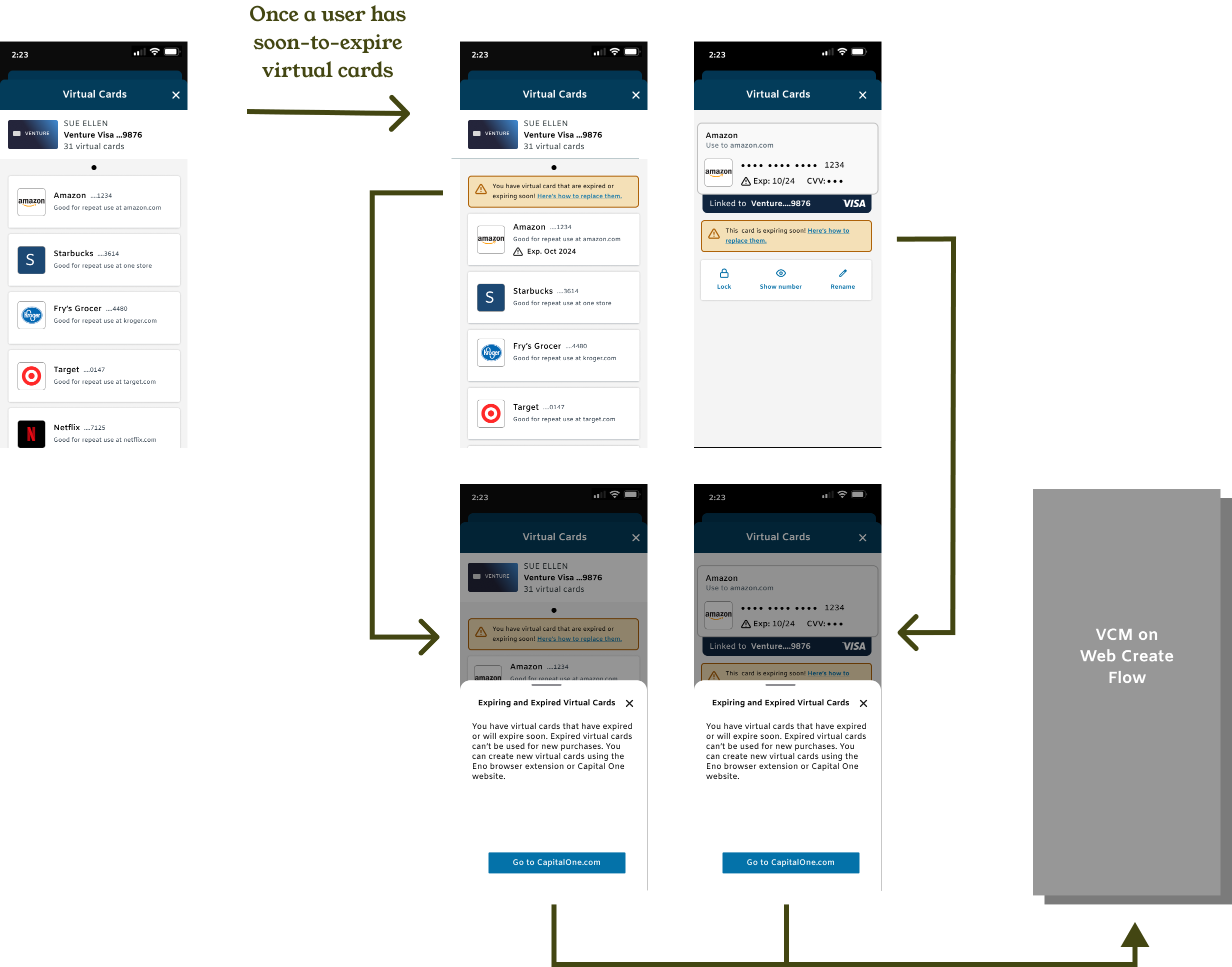
A demo of the Iphone native expiration experience flow. Until users could create in native, we created messaging with strong visual hierachy to provide the avenue to re-direct our users to web in order to replace their cards.
While adding a warning icon in a vaccum seems easy enough, I had to consider how the space the icon shares with the other status states a virtual card might be affected. In order to ensure clear communication on our end on the status state of any given card, I mocked up all of these across platforms for each of their card status states to cover all our bases.

An example of how I document reconciling a card’s status state + various controls for design hand off. This is helpful in saving time as well going into refinement discussions with tech and product.
We realized eventually the alert messages may not be enough--its been over a year if not longer for a lot of users since they created their virtual cards and may have them as saved payments across the various merchants’ sites. I worked on designs to inject relevant how-to language for our users who will, across time, will be given more touchpoints upon which to create their virtual cards (eg. exclusively from the Capital One App to both there and the VCM).
Post-creation language within the virtual card replacement process, we hypothesized, will help remind the user to not be disrupted in a future spend moment, confusing their old expired card with the new one they made before.
We knew we needed to iteratively research and validate what strikes the fine balance between sufficient guidance and clunky, friction-inducing verbiage.
Validating Current Verbiage + Future Concepts
Due to time constraints initially and careful deliberation thanks to feedback from our partners in legal, we got these designs out to market quickly and before the first wave of expirations. Afterwards, we could spend some time measuring the degree of success of these changes with our users. I worked to lead and compile the research as the main designer for the experience space. Alongside the impact of the current in-prod designs, we tested an alternative future-looking concept to get an early read on its design.
The research outcomes demonstrated clear user understanding of the implemented expiration warning changes and replacement language so we could feel confident in the viability of what we had already put out and continue to move forward in planned improvements.
Users also somewhat surprisingly reacted positively to our future create-on-web concept despite being very different from what is currently live. It aims to provision the replacement entry point at the moment of creation so that replacement doesn’t need to have it’s own seperate entry point within the VCM. Due to being nestled within create, the only signal users would need to see then would be the warning in-line message when appropriate. This way the mental burden of searching for the expiring cards is taken off the user’s plate.
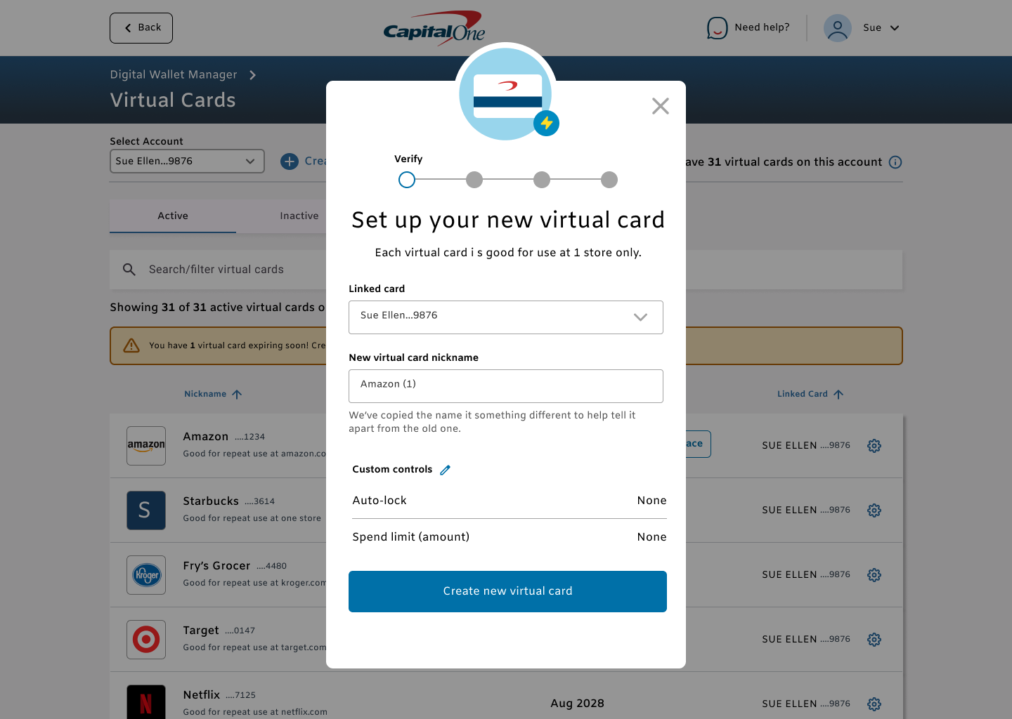
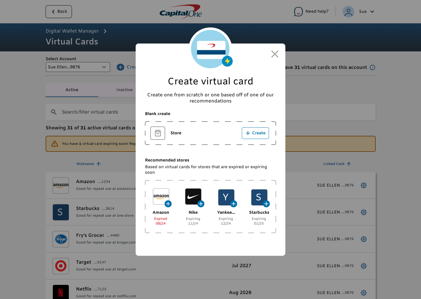
We tested two future replacement concepts with one mirroring a flow more closely similar to the replacement flow in live and another more amibitous create-to-replace flow. While the one similar to live tested well for clarity unsurprisingly, the more amibitous concept surprisingly tested well with users as well.
Looking forward…
Within a year, instead of being unpleasantly unequipped to replace a suddenly expired payment method, users have consistent expiration call-to-action messaging, regardless of which platform they access their virtual cards to replace their virtual cards. From any of those touch points, they have replacement guidance specific to their virtual card product platform eligibility. No need for guessing on next steps should they want to continue to spend using those cards.
Even prior to the validating research we could see positive indicators of virtual card success—with the MVP going live in Ocotber of 2022, alongside the first wave of expirations and other tangental virtual card expansion efforts, it was measured that virtual card monthly active users increased by ~533% over the last year by EOY. Sustaining this activity would not be possible if frustrating disruptions in customer spend was an unaddressed issue with this product.
With research pointing to the positive impact of the expiration ground work, we would be looking to tackle bulk action capabilities as the next step. Power virtual card users will likely not want to have to renew all of their expiring virtual cards on a one-by-one basis so giving them these capabiltiies is hypothesized to retain these users and their spend. This would require design and research efforts surrounding best interaction patterns while looking forward to aiding in the saved payment replacement process for our users.
Our destination state involves designing for a more seamless and aggregated virtual card home base with all of a user’s virtual card services into a single hub to manage their spend with ease.
Key Constraints that influenced the End Product
Tight deadlines
We needed something out fast so I put out quick and dirty text that we did not have the time to test but used design heuristics + content designer + legal review to ensure clarity of text and context. Design-wise, I worked to ensure the update coverage was complete across our VC products in the initial release. Insuring the work signed off by all key parties in a timely manner was core to the effort’s success
2. Rapidly evolving technologies
The broader team was aligned to the end goal state (users never have to renew their cards) but there was a large gap between there and the current state that tech and product were currently iterating on, some opportunity or constraint development every other week. This meant that while we had the ambitious in mind, the design solutions had to be quick and simple iterations until the longer team tech/legal feasibilities were smoothened out. That being said, I took advantage of the time by testing current text viability and gauging user attitudes towards novel early design concepts for how we could allow for an advanced renewal bulk action flow.
3. Virtual Cards are a fairly novel concept to even regular users
Given this work lies within spending, a key part of people’s finances we had to make sure our users were clear on what this product does and how to use it. User confusion on how the product works limited dramatic leaps in the product experience as we wanted to avoid customer loss. These iterations in the expiration experience allowed for new natural spaces for us to help educate users on their virtual card capabilities and limitations until the concept of virtual cards is more commonly understood by our users.