
Revamping Audit’s Core Tool, the Risk Assessment Form
August 2023 - April 2024
The goal: Transform one of our auditors’ core tools into a more productive space that optimizes their time spent on tasks inside and outside of it to improve the overall audit process.
Context + the Big Picture Summary
Auditors are a vital aspect of Capital One’s commitment to fair business practices by ensuring the company is not at risk for breaking important consumer and finance regulations, saving the company indispensable amounts of money in government and legal fines.
Capital One’s internal Risk Assessment (RA) tool is one of their key review tools built with just that mind. That being said, it was constructed quickly as a band-aid solution to federal audit legislation that deemed it neccessary for companies to have more updated practice evaluations.
This means despite covering its most basic of bases, the holistic product experience had not been properly budgeted for in the original build effort.
The need to improve was not just a conjecture on the design and product teams’ end, but a well-documented user need and resulting business case. The RA tool’s poor heuristics was costing our auditors anywhere from 2-3, up to 44 hours and risking audit accuracy due to the mental fatigue that mounted with each task in the RA questionnaire tool space. This translates into a conservative estimate of $22,000,000 alone that the company is losing due to rectifiable inefficiencies. Thanks to previous design research prior to my time on the team, users pointed us towards having grief with navigation, which (in part) fed into struggles with parsing information, verifying accuracy, among other issues.
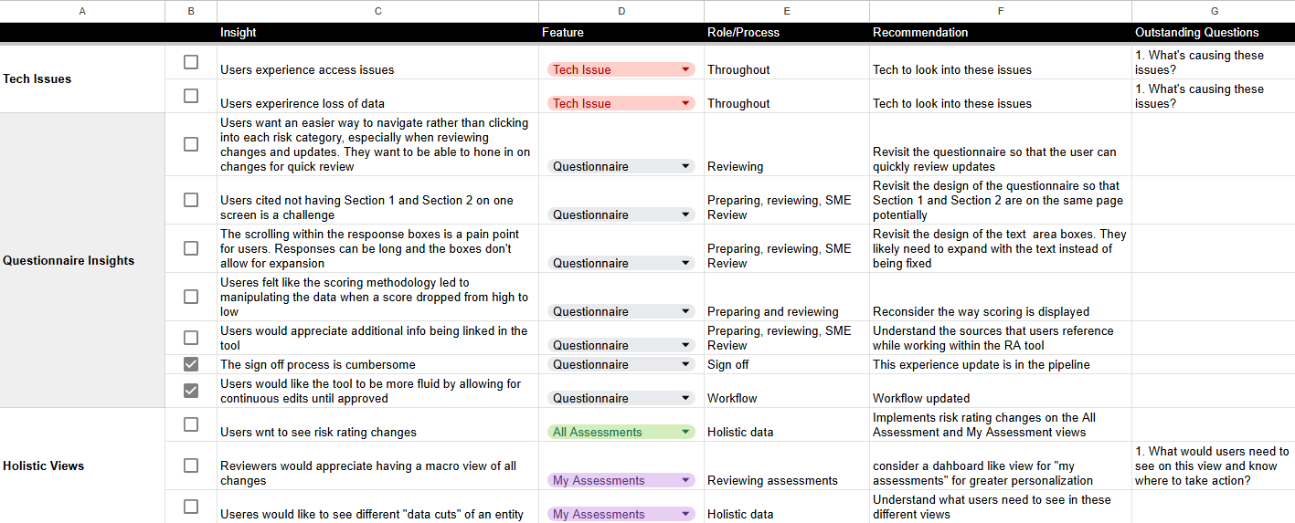
A mock up of our known user issues spread sheet—this is just a sample of a longer and more extensive user needs list!
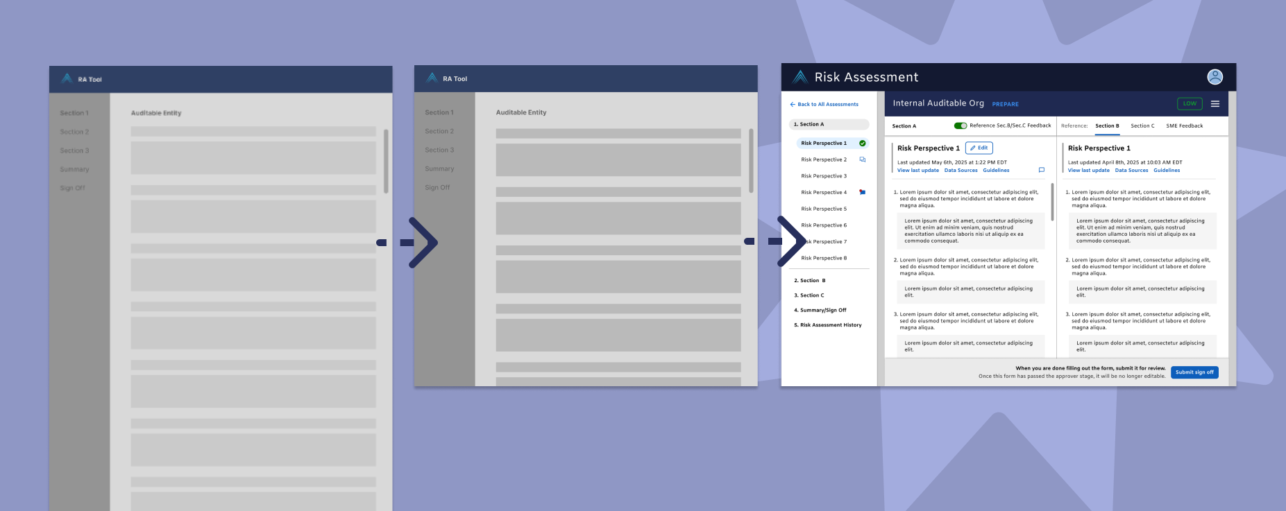
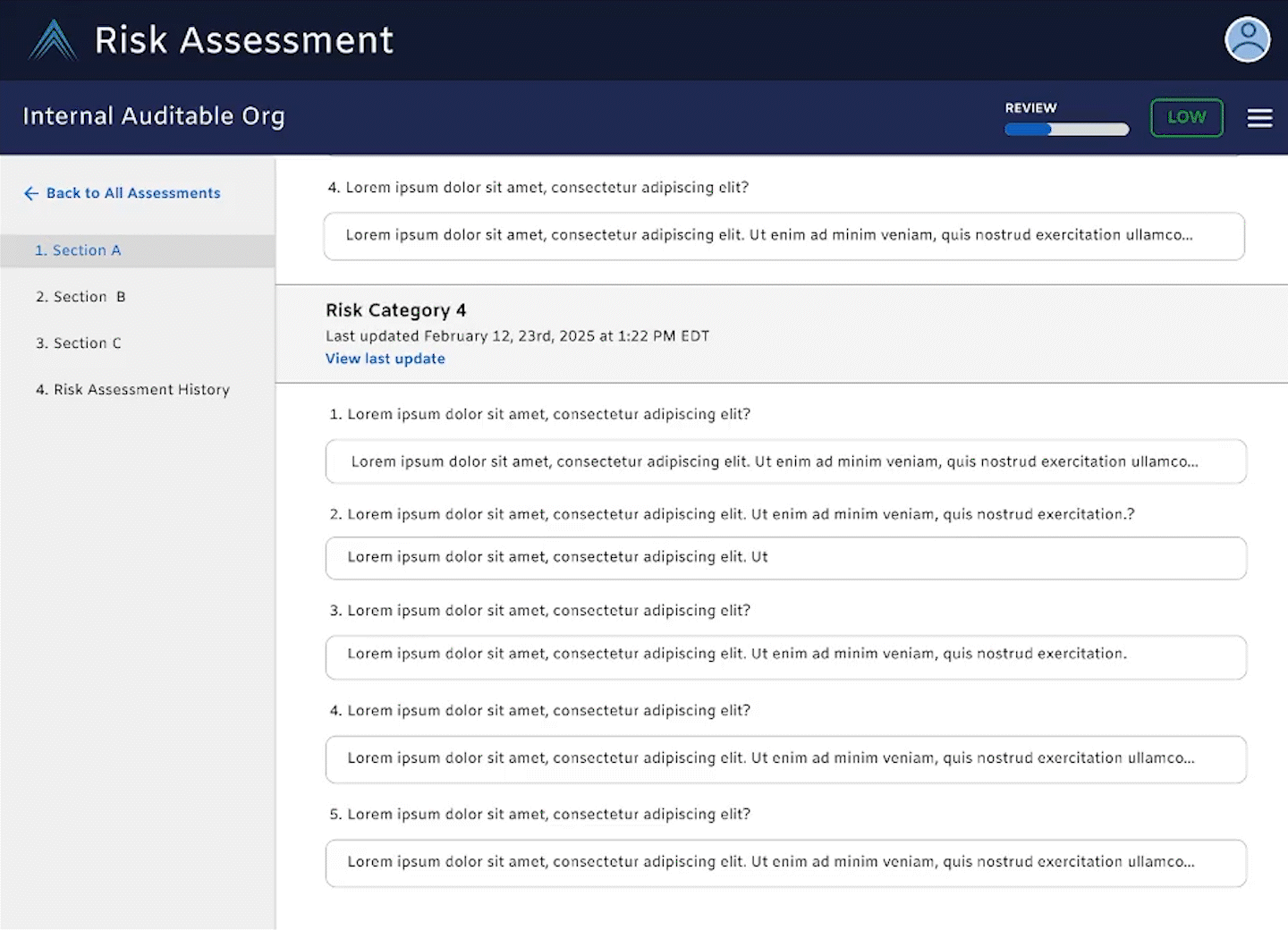
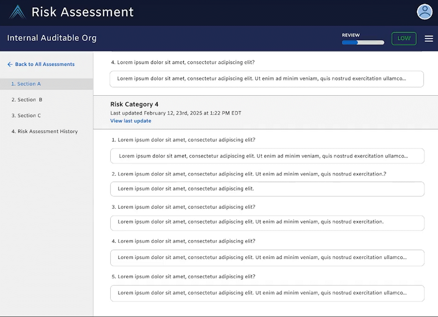
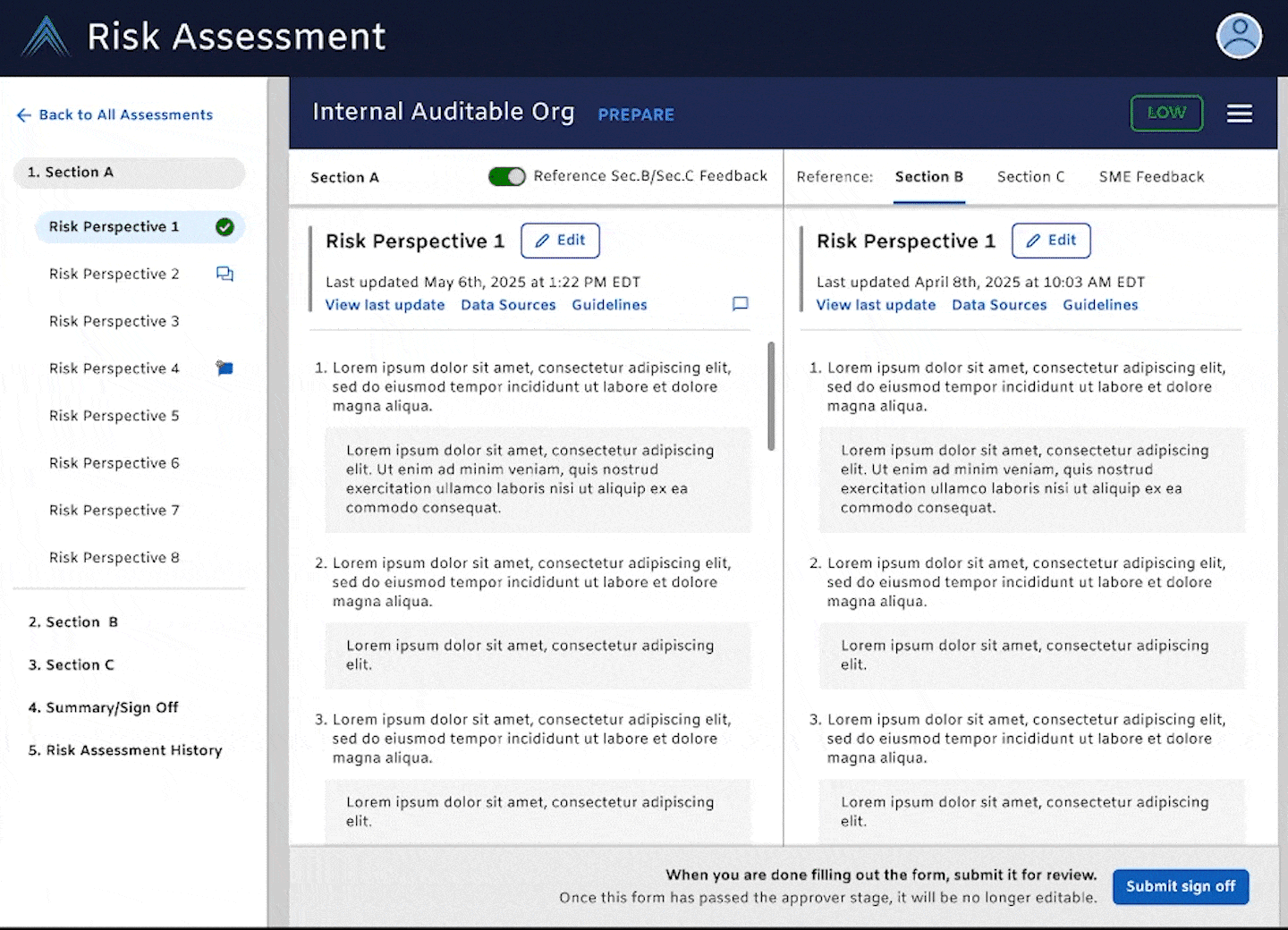
To address this, we mapped out a future-state that cut down on a screen UI that was 19,134 pixels long in Figma to a design that comfortably fits within a standard desktop viewport within 1-3 scrolls, if any (for reference, a desktop viewport height is generally 1,080 pixels). Instead of having to scroll endlessly to reference information put in one response to another, users can click between much more focused views at the question level, and jump between sections at a greater specificity then before.
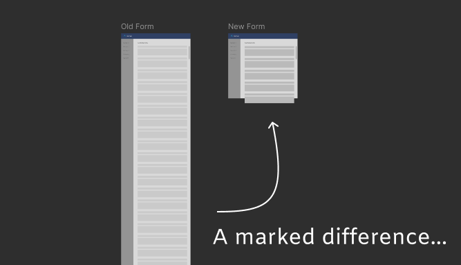
Old form on the left, New vision-state form on the right
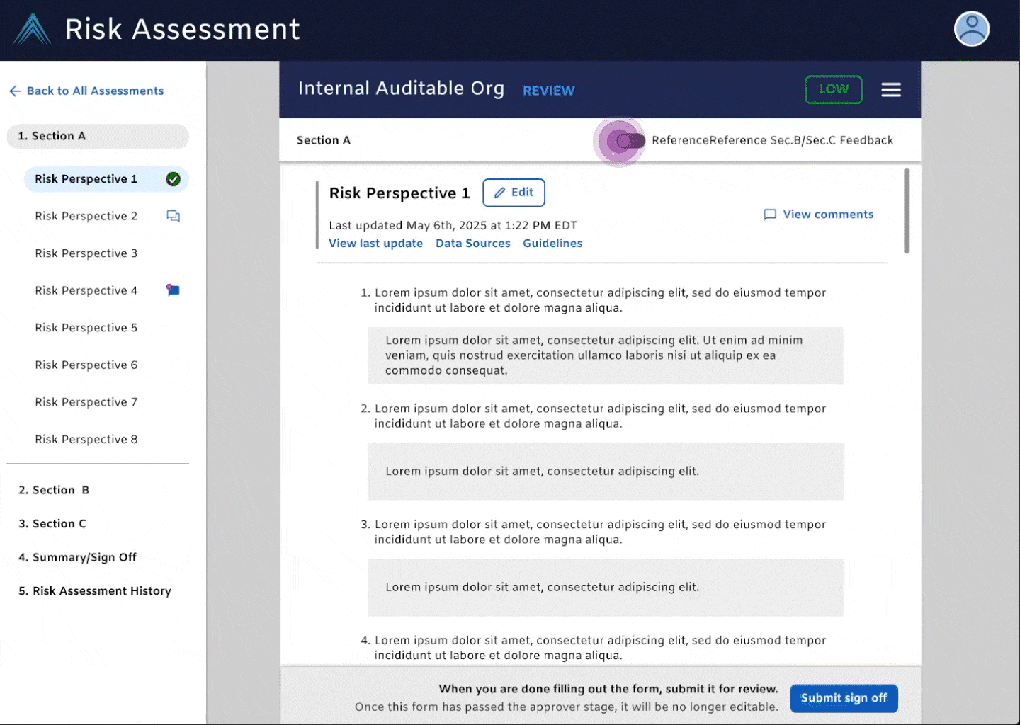
For the future, we mapped out with our tech team a destination state, side-by-side comparative view to cut down on navigational and mental burden to ensure accuracy and make the relay-race like effort of completing a risk assessment form much more streamlined than before.
Until the vision state is fully built out though, we updated the sign off to cut down on wasted time forms spent in limbo worth $2 million USD in billable auditor hours. By moving the sign off button to a persistent location, auditors no longer had to dig and find within the form the means to progress a form or find a previous collaborator. Rapid user feedback post-release indicated the sign update had a postive impact on their hand off process and was much more clear to access and use than before.
When it comes to evaluating the overall product health, our north stars to improve were the Google HEART Framework metrics of user Happiness, Adoption, Task Success, which we knew we would measure directly post-release from routine annual research conducted with our intended core user types.
We also oriented design decisions based on outlined organization-level goals. We knew that Internal Audit faces an increasing set of challenges as the enterprise becomes more complex—the vision is to create well-researched solutions customized for Auditors that shift cognitive load towards higher order, judement-based assessments. This means creating intelligent insights, automating the redundant, contextualizing experiences based on history and role, and reducing product silos; our RA Questionnaire re-vamp designs were driven and to be tested by these specific principles.
Early Wins
At the time I joined, there was a laundry list of user needs that we could tackle thanks to Design’s early interest in hearing what our auditors had to say on the RA tool.
-
Think of it as like a relay race between 3-4 different people. As the form was filled out, different types of users would need to go in and out of the form to get it to completion.
Its existing state consisted of manual information entry, checking the summary for changes made all the way at the bottom of the form, scrolling up from one polar end to another to address comments or make edits, making sure information is correct by scrolling all the way down again, waiting on teammates to approve your inputs, reading their comments, and scrolling around to find the comment made on question 12 in another section…again.
The efforts to improve were intially concrete—one such initiative was to improve the sign off experience. When a user was done with their alotted work, they needed to sign off their work and let the system know to let the next teammate know they could begin their review of the former’s work. As is, users were struggling with getting their part past the finish line due to not being able to understand the signoff interface.
Tech and product had new capabilities that could be implemented so tackling this was a no brainer.
One of the most significant influencing factors for the steps’ lack of completion was users forgetting that they would need to navigate to the section to complete it.
An auditor could spend their entire work day, if not multiple completeing their audits and in the frenzy, forget to push the work to the next guy…until said guy comes around asking about it.
The sign off section looked like it was something that required typing input, when all a user needed to do was click a sign off button to move the work forward.

Hard to quickly parse information based on the UI -- so what at what step is this at?
Am I supposed to type my name in before I submit my sign off?
Why do i have to scroll all the way down here before I sign off anyways
I didn’t even know this was down here…
Do I just type here if one of the assignees change?
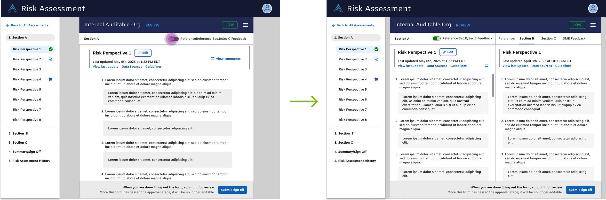
While ramping my understanding of the auditing work up to speed, I updated the interface to accurately reflect the required inputs from users and introduced tailored language based on their role. This section of the form now adopted newer organization design system elements, modernizing the UI and backend.

Can quickly tell which step this form is in with multiple consistent signals on screen
It’s clear nothing on my end is needed interaction-wise besides submitting sign off
Serves as an efficient reference for grabbing relevant people’s information
Didn’t have to navigate to this section to sign off as the sign off bar is persistent regardless of which section of the form I’m in
Post-release, we had auditors positively responded to the update, commenting that the new stickied sign-off bar was successful in helping them remember to pass on the project and made the status of the document clearer.
-
The space was complex so I used early projects like these to help get my understanding of the product world up to speed—I like to map out diagrams of my understanding of the space as I work on a product and bring these into my tech/design refinements to show my collaborators my understanding and it helps with getting rid of misunderstandings early. Also serves as a helpful grounding contextual artificact for guests in these calls.
This release was followed shortly by a more subtle update to the Autosave experience. This feature was intended to save auditors the grief of lost progress but instead, it created aggrevation because the user was spammed with the status snack bar, leading to it being doubted even credible. We smoothed out the auto save by replacing the 3rd party code that the tool was using with a design system temporary snack bar and pushed the timer delay to 5 seconds, per general UX guidance.
A mock up of the old autosave on the left (top if in mobile view) vs the newer version on the right—imagine that snack bar spam….
This was low-hanging fruit that aimed to significantly improve the quality of life when filling out and editing the form, augmenting user satisfaction/happiness and trust using the tool.
But while important, these small improvements made us as design realize we were working within obsolete capabilities and tip-toeing around the most significant product improvement: the intra-tool navigational design.
We knew that users were struggling with mental fatigue and the mechanics of navigating the entirety of the tool since filling out the form required a cross-pollination of sorts
To avoid further tech and design debt, we needed to take on improving the structure of the product as it was not only a significant complaint from our users but also streamlining it would be aligned with our organization-wide identified goals for the audit tool which were combating execution risk and disconnected data.
This was an investment effort to build out features that maintain CapitalOne’s high standard for operations and elevate the space to meet emerging Audit capabilities.
Strategizing the Design for MVP and Destination State
With a dramatic redesign in mind, we put a high-fidelity prototype through user testing to evaluate new capabilities being introduced.
Prior research gave us a solid starting point: allowing for drill-down-to-some-degree-of-specificity capabilities would be huge. What this failed to capture was the viablity of a novel side-by-side view UI, a radical way of looking at the data and sections of the form. Our guess was that this would be something invaluable to our auditors. We needed to see if this was true though.
I designed a medium-fidelity usability prototype that we would introduce in user testing to get a general feel for user attitutudes toward the concept. After interviewees completed a mock up of tasks they’d usually perfom in the RA tool, we asked them questions around ease of use, knowledge of space, and their attitudes toward the navigation and side-by-side view. We took advantage of this research session as well to get some user guestimations of some of our major target metrics such as cutting down on fill time and time spent filling out a given form.
Much to our excitement, our interviewees consistently responded optimistically to the enhanced navigational specificity and a little surprisingly, the novel side-by-side concept. They reported a generally well understanding of the UI and would potentially appreciate this layout as a means to speeding up their workflow while also promoting more accurate responses.

“Having this info handy and easy to access would make the process easier” - an interviewed Preparer and Reviewer

“Having Section 1 and Section 2 on the same page makes it difficult to assess a risk category together; scrolling back and forth takes more time” - Individual who was a Prepare & Reviewer
Strategically, this is exciting because it has the affordances to enhance the task flows of not just one user archtype but for all 5 of them (we love a flexible and inclusive design!) as well as the other form types. With this, we were able to proceed building the high-fidelity prototype!
-
Design deliberations needed to be understandable across several user types and translatable across different workflows--there was a lot of effort devoted towards designing introduced changes to apply to more than one user given the tech effort to introduce it to the space and its exposure to other users.
At the same time, discretion was warranted for smart decisioning in the background to see what features and language could be presented based on the user type to reduce mental burden of each user to discern general info from critical pieces they need.
This particularly held true for the RA Tool redesign work: the space needed to accommodate for several different form types with drastically different number of sections and section titles--this needed to be accounted for in flexible interface design. For some users, referencing section 1 vs section 2 was their key work flow while for another user referencing section 2 and section 3. We dreamed of tackling making a form easier to complete a task that could cater to both of these users. This resulted in the side-by-side view development which cut jumping from top of (x) pixel long form to (x) pixel long side by side scroll -- we were able to discern what was critical thanks to direct user testing of an early concept and key stakeholder involvement.
Designing a Feature-packed Now and Future
With enhanced navigational specificity and comparitive views as the driving design themes in mind, we mocked up the following features.
Instead of longform scrolling, compartementalization of each section allowed for easy swapping in-and-out of sections out within a form.

Old RA Form: navigational specificity only at the section level

New RA Form: navigational specificity only at the section level AND sub-section level
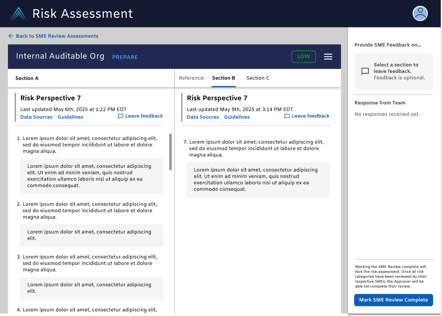
Expanding side-by-side views can be tailored to the specific reason and person visiting the tool wether it be preparing, reviewing, or reacting to comments left by other auditors.
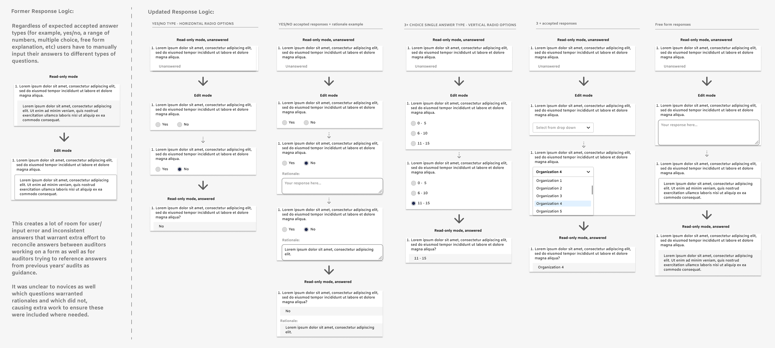
With the help of legal input, we standardized how Auditors fill out their forms. Instead of having to generate answers organically which introduces mental burden in performing response reconcilliation, we introduced parameterized responses for the different question types in the forms from drop downs, radio buttons, and free form responses.
While this is a dramatic change to the status quo, my early and consistent communication and desire to understand tech generated good trust in the viability of executing the most important changes, enhanced navigational specificity and the side-by-side views.
For future sprints, we addressed how we could solve for currently documented pain points building off the MVP changes and new UI.
We would eventually do away with autosave and introduce a edit/save function to prevent accidental response tampering.
Instead of searching for the question with comments left, they can easily see which one is it based on the comment icon in the left navigation menu and then address it without losing sight of any needed reference material, which the old form sacrified by taking up vertical space.
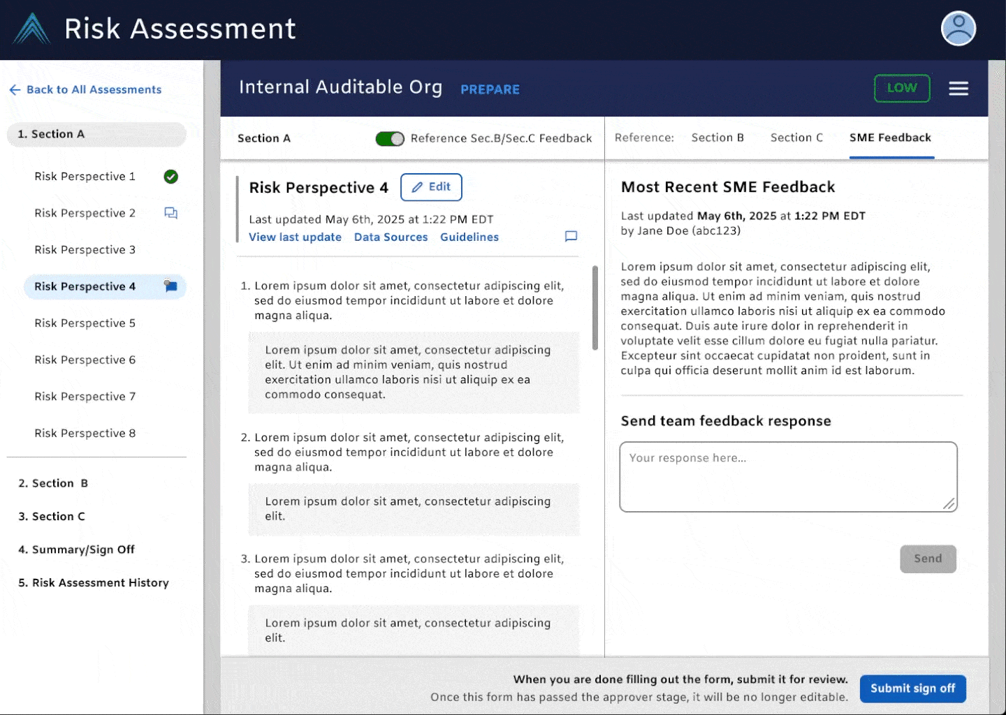
Most of the updates concerned improving the preparer and reviewer form experience. But we made the effort to also touch upon another core user type’s, Subject Matter Experts (aka SMEs), task working in the tool. Given SME’s only have one one small slice of the form they need to review, we give them a dedicated pared down view so that they don’t have to scroll the canyon that is their two dedication sections within a form. Now, they can leave any comments needed while having their assigned material, making doing their due dilligence easier.

Plans for the Future
With the RA Questionnaire re-design MVP set into motion, design was eager to set sights evaluating the holistic capabiltities of the tool. I worked on early designs that sought to reduce the amount of time a user needed to drill down into a given form to complete an action—there was a lot of opportunity identified to support quick actions at an earlier level in the tool than the form so I brainstormed how that could work.

Above: the current UI for viewing RAs. Some helpful superficial information is displayed but auditers still have to enter the document to see meaningful information

Above: the proposed future UI for viewing RAs. This experimental tableview promotes surfacing more information from the forms without having to drill down to find it. Auditors with different responsibilities to different parts of the form can sort RAs by the information that is pertinent to them instead of having to manually pull up each one at a time.
The tentative tableviews aim to synergize with the RA form updates to add momentum to modernize the tool, reduce error, and reduce the mental burden for our users.
My detailed artifacts map out the future of improvements for the space in respect to core user needs and organizational-level goals.
Projected within the future (outside of my time on the team) is my team’s annual product assessment, conducted by our embedded Audit researcher. Based on our outcome-oriented design decisions, we expected to see positive change in our HEART metrics yearly assessement specifically relating to the Happiness, Engagement, and Task Success. For the even-more distant future, we would be able to begin assessing the product through the lens of Adoption and Rention since this release would establish the baseline for future evaluations to be compared against.
Positive improvements in the Happiness, Engagement, and Task Success would then be ideally mapped to the higher level success measures such as reducing hours spent auditing via reduced redundant tasks to establish the performance of these design decisions.