

Early Warning Services: Identifying Zelle Road Runner’s Future
January 2021 - August 2021
The goal: Identify the UX and product requirements merchants need for seamless transactions
Starting out…
When I joined Early Warning Services in January, Zelle was on its way to facilitate over 392 million transactions within Q1 2021, totaling at $106 billion sent over its network in that period alone. Zelle is well-established in its market segment yet it was looking to grow and expand even more.
I became a part of Zelle's team January through August 2021 for its next big development: an innovative digital commerce pilot product, codenamed Roadrunner. This team consisted of UX, product, developer and security experts.
In the beginning, there was a barrage of ways I thought about the pilot:
How are we going to uniquely design for our 3 primary users--the merchant customers, merchants, and our banking partners in one succinct product?
How are we going to be able to build to scale for all our bank partners’ needs (the 8,000+ of them)?
What are the use cases for the merchant customers? The merchants?
The list of questions went on.
Discovering what I needed to be asking
To get some of these answers, first: preliminary user research. I collaborated with product to vet interview questions and designed medium-fidelity screens of our team's initial draft of Roadrunner’s commerce screens and competitor screens.
These were shown to interviewees to gauge their satisfaction with competitor flows and identify where improvements could still be made as these would be key opportunities for our pilot. Our interviewees included merchant customers and the merchants themselves.
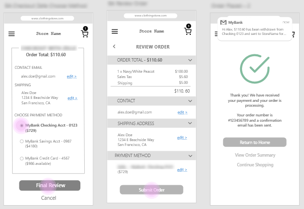
Example checkout screens
3 divergent checkout screen flows created in Adobe XD I created for preliminary user testing
Merchants and customers alike echoed a baseline requirement from our pilot: the need to create something that integrates seamlessly within or alongside ecosystems they already use.
Through these I realized there was much to learn about designing for our “middleman” users, the merchants, that could be explored and contribute to the success of Roadrunner.
This drove a personal fascination to learn and guide the team towards answering:
How can our project better serve merchants than our competitors do in an already saturated market?
Well, what are they saying it should look like?
Ready to go full speed ahead, the team’s UX-ers started crafting the early merchant customer UX flows, the dev’s hackathon-ing an ideal authentication process, product gathering the business requirements, and I, pursuing my merchant curiosity via journey mapping our newly recruited pilot participants and working with devs to get our team on the same page on our pilot’s transactional flow.

In our Zoom interviews together, we explored what the pilot participants’ typical transactional experience was like, how they processed payments, what type of payment methods they took in order, and so on. I needed to learn what kind of moments our pilot would solve for, whether it be a physical or a digital one.
...It actually wasn't something to "look" at
Cumulatively, we painted an early portrait of how Roadrunner would better cater to merchants even with the options they have currently. The most striking takeaways were:
Roadrunner app screens were not going to be necessary and potentially even a hinderance to merchant's daily business.
Roadrunner needs to leverage minimalist function and other services from Zelle instead.
Along a similar vein, merchants also favored entities they could trust. New screens injected into their work process were not neccessarily better.
Although Roadrunner is still ongoing, my work remains the basis for the merchant UX design principles. They serve to emphasize the importance of the merchant when the pressures of the other user personas dominate the conversation at the team table. Roadrunner’s success is intimately linked to future-proofing the unique needs of all 3 of Zelle’s pilot project users which drove my investment in merchant advocacy.

Above: My pandemic internship momento; a screenshot from the August internship share out with the other interns, EWS CEO Al Ko (3rd row 4th image from the left), EWS Intern Manger Kendra Leisher (top left), and our mentors!