Adobe Creative Jam 2021: Locally
July 15 - July 29, 2021 (1 week of planning, 1 week of design)
Placed third in an international design competition hosted by Adobe by marrying physical experiences that mirror the digital.
Project Link: Locally Adobe XD Mockup
Context
Last time around, out of 400+ entries internationally, my teammate Vamsi Karuturi and I placed within honorable mention. This time around, we gunned for the top ranks.
Adobe partnered with Instagram to challenge us to design an low-network accessible app that promotes the voices of small merchants and empowers individuals to support small businesses in their local vicinity. We had one week’s time to create an interactive prototype based on the prompt.
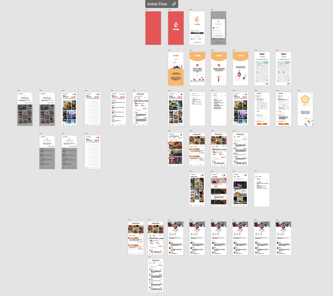
We hit the ground running with design principle ideation and concept generation, giving birth to our app concept, Locally.
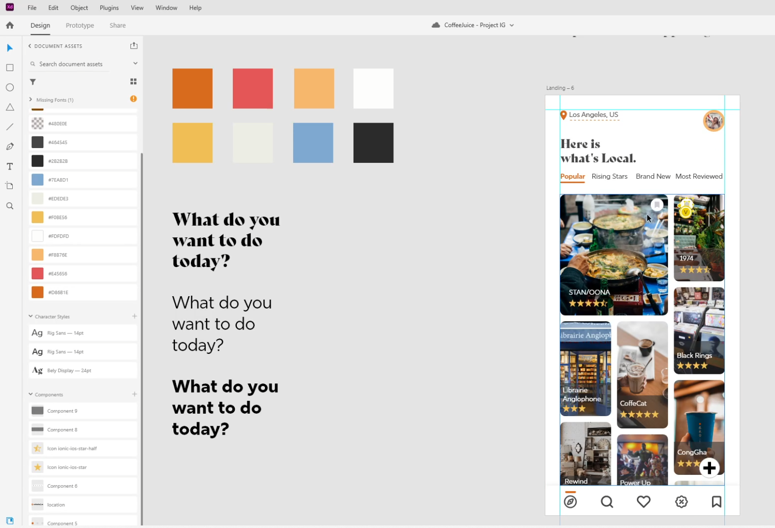
Locally needed to be an app that digitally immersed the user in the small business culture around them from the home screen alone. From the get go, the user can see a digital local business landscape that is as unique to the area as the area’s physical qualities are.
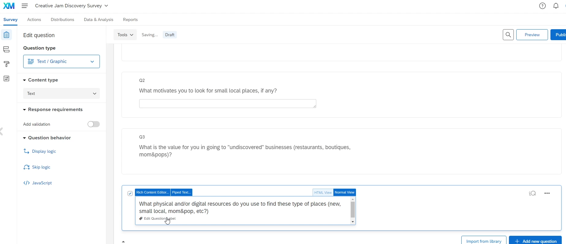
Putting together user research questions to get a more in-depth understanding of how people look for new spots in new places
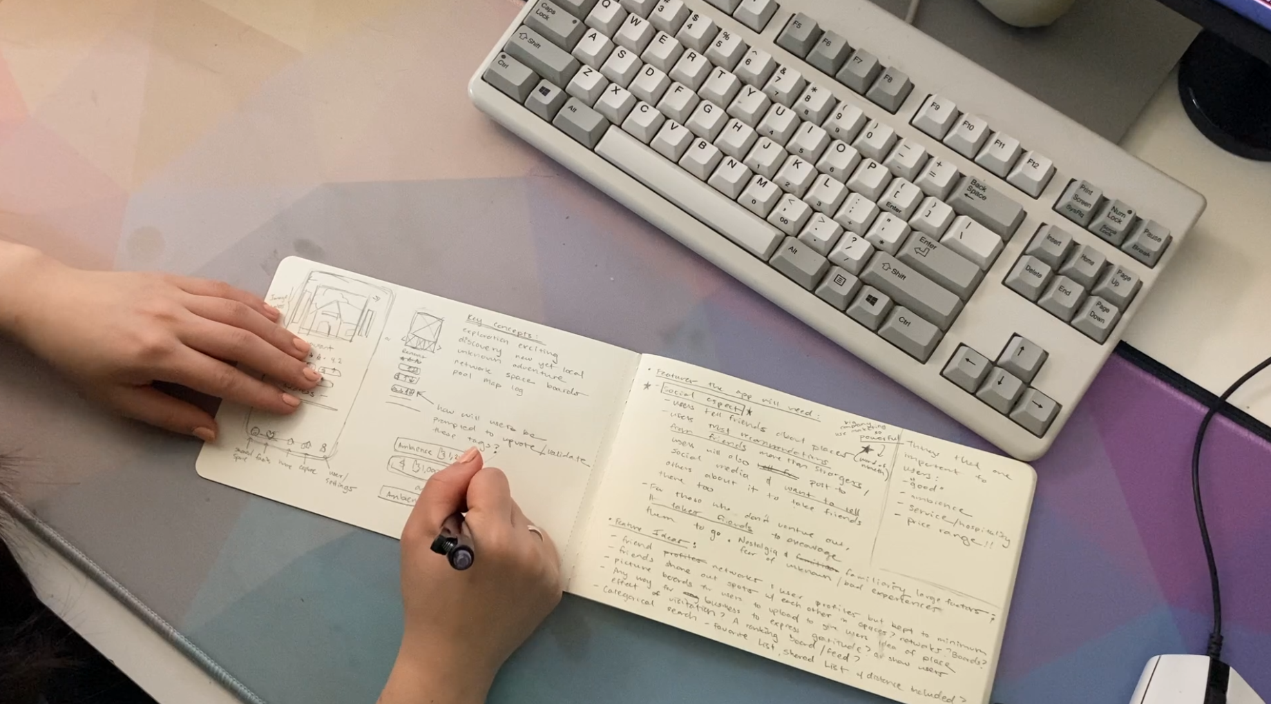
Ideating UI — it helps to get it all out on paper
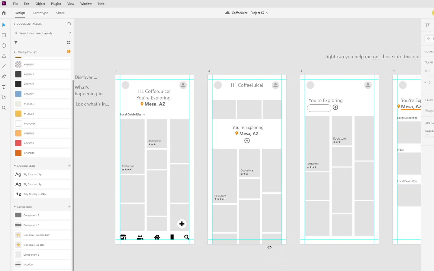
Low-fidelity mock ups help us stay open-minded about lay out options —we knew we wanted the home screen to be visual-heavy to get users excited about their digital landscape
The concept phase was developed after a rigorous 2-3 days of brainstorming, brain dumping and collaborative back and forth between Vamsi and me.
After landing the driving design principles, we went into wireframing and into low fidelity mockup screens. An important aspect of this phase was our intention to be mindful of language and designs used outside of the US and a western point of view. This meant design details like using a restaurant’s cost range represented with a text estimation instead of a dollar sign scale (e.g. Yelp’s cost estimate) as this was not customarily used in our example country, India. We instead experimented displaying the cost estimate as “rupee amount feeds ~2 people” as this text space and copy could be easily adapted and understood across other languages even if that was not the norm.
Low-fidelity mock ups help us stay open-minded about lay out options —we knew we wanted the home screen to be visual-heavy to get users excited about their digital landscape

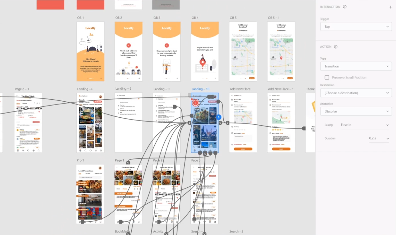
Prototyping to bring the app idea to life
A working draft of our pitch to the judges for the day-of competition presentation; we aimed to succintly deliver our idea while still highlight the unique aspects of it
Important to us to include as well was the low-network accessibility capability/a light version of the app.
The goal of our light version was to be accessible too. We displayed to the user key information about a small business sans photos in the case of poor wi-fi connections. We would instead provide descriptive tags of the small businesses on then home page since pictures may not load reliably.
This way the user can still get a sense of a business's personality and navigate to a place of interest.
Outcome
All said and done, amongst 579 participants ranging from the US, UK, Canada, Mexico, Denmark, Finland, and Norway, Vamsi and I succeeded in ranking 3rd place in the competition, triumphing over submissions from schools like U of Southern California, Columbia U, Simon Fraser, Parsons, and Berkeley.
We were able to get invaluable feedback from the Instagram UX design judge panel that challenged us to even more intimately design for specific user moments with our app but that otherwise our app stood out as a truly coherent invention that they could see in the app market. I am very thankful for their critique and it has reminded me to strive to more evidently incorporate genuine user moments at the heart of my UX practice.