

ASU Interactive Map App Redesign Exercise
Fall semester 2020
The goal: this Master's program design project sought to evaluate the usability and efficacy of my university's proprietary map app in wayfinding. I was passionate about this subject due to my interest in accessible, safe public transit.
Project Link: ASU Interactive Map XD Demo Link
A little background:
ASU provides a proprietary map app that anyone in the public can use to navigate their way around the various ASU campuses. That being said, from my experience as an ASU student, it did not appear to be a widely used app and I was eager to discover why.
The research and discovery phase consisted of collecting field survey interviews, user interviews, and a heuristic analysis of the app. This revealed that users:
primarily accessed it on a native, mobile platform
found wayfinding cumbersome/overwhelming
felt neutral to very unsatisfied when using the app despite being able to accomplish tasks with relative ease.
My findings determined the following changes as proposed solutions: iconography changes, using more text to supplement confusing iconography, site plan rearrangement, making building names readily available, and making directions to locations more easy to find and use. These solutions synergize in order to make using the app less cumbersome, overwhelming, and frustrating.
Oh, to be in Seattle again…
The project topic was inspired by a previous trip I had made to Seattle, WA where I had become a dependent user of their Transit Go app (which I still have saved on my phone as pseudo-souvenir of the trip). I was amazed by how informative and convenient it was to me as a temporary visitor of the area--there was no guess work on my end on bus arrival times and Link routes!

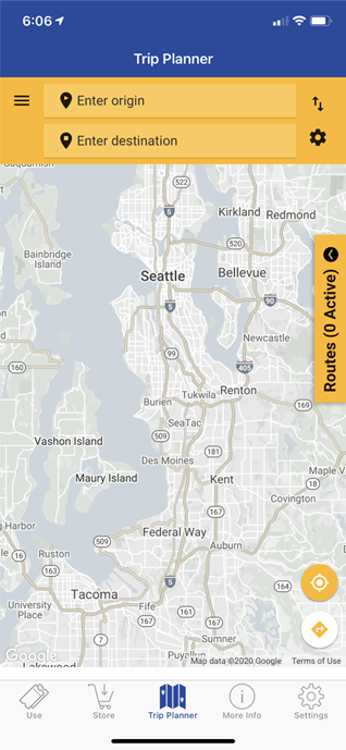
My delight with Transit Go’s app strongly contrasts against the brief experiences I have had with ASU’s IMA, which I begrudgingly used occaisonally as a regular bicyclist on campus. I was curious to analyze ASU IMA's UX so I began with several research methods to validate or invalidate my suspicions.
Research
First, I cast a wide net by creating a survey and distributing it within a space I knew current and former ASU students populate, which was Reddit.com’s ASU topic page, r/ASU and ASU’s student slack channel. I received 14 responses total.
Knowing that the answers from the survey could only give me the “what” of the attitudes were towards ASU’s IMA, I also planned to schedule a couple interviews with ASU IMA users who could give me contextual “whys” to my survey questions, such as “Is this an app you’d recommend to friends and family” and “How easy is it to complete [any given task] in the app?” I was able to recruit 2 people for interviews conducted over Zoom.
Finally, I heuristically analyzed ASU’s IMA to identify smaller issues that could point towards key usability insights.
This combination of various methods I think was useful in that it combines non-design and design background based point of views which can identify unique problems that would be overlooked or not articulated by each group separately.


Results from the user surveys and interviews yielded the following attitudes:
Although ASU IMA users got to campus a variety of ways, when using the IMA app to get to campus, walking was the most likely mode.
Mobile is the preferred platform for using the app (versus the web version).
Finding where a building is on campus, directions to a place on campus, and finding services are the top 3 most important use cases.
Although the app provides a world map as its map interface, no one used the IMA to look beyond 5 miles of any given ASU campus.
Most people would recommend the app to friend and family but with hesitation.
The app evoked a lot of neutral attitudes, with difficult and unsatisfied being next most prominent emotions.
Both interview users mentioned the cluttered UI when looking for pins or locations.
Icons don’t clearly hint at what they contain
The sidebar does not go away with a swipe--have to tap tiny back button on bottom right of nav pullout
UI feels cramped, especially since nav bar pulls out horizontally not vertically and with inconvenient timing
“Use my location” icon changed to a different icon when in active state
Finding directions requires manual A to B input and is not coupled with the location search flow
Takeaways from my heuristic evaluation included:
A major app analysis breaking point for me was this: the app did not allow me any easy ways to use information with different wayfinding features. Every feature of the app was a stand alone flow that could not utilize information from a previous task flow. This is a core feature of the map apps I had used before.
It had seemed to me ASU’s IMA needed a dramatic UX and UI overhaul.
Concept Ideation
I spent 1-2 weeks on this phase. At the beginning, I studied other map apps such as Google maps, Apple maps, and Waze to understand what design choices that they have that work well.
Part of its design was also driven by creating some design principles the app to help keep brainstorming for the design focused--ASU IMA needed to be on-the-go friendly, respect the user’s time, understand what the user finds important, and not be overwhelming.
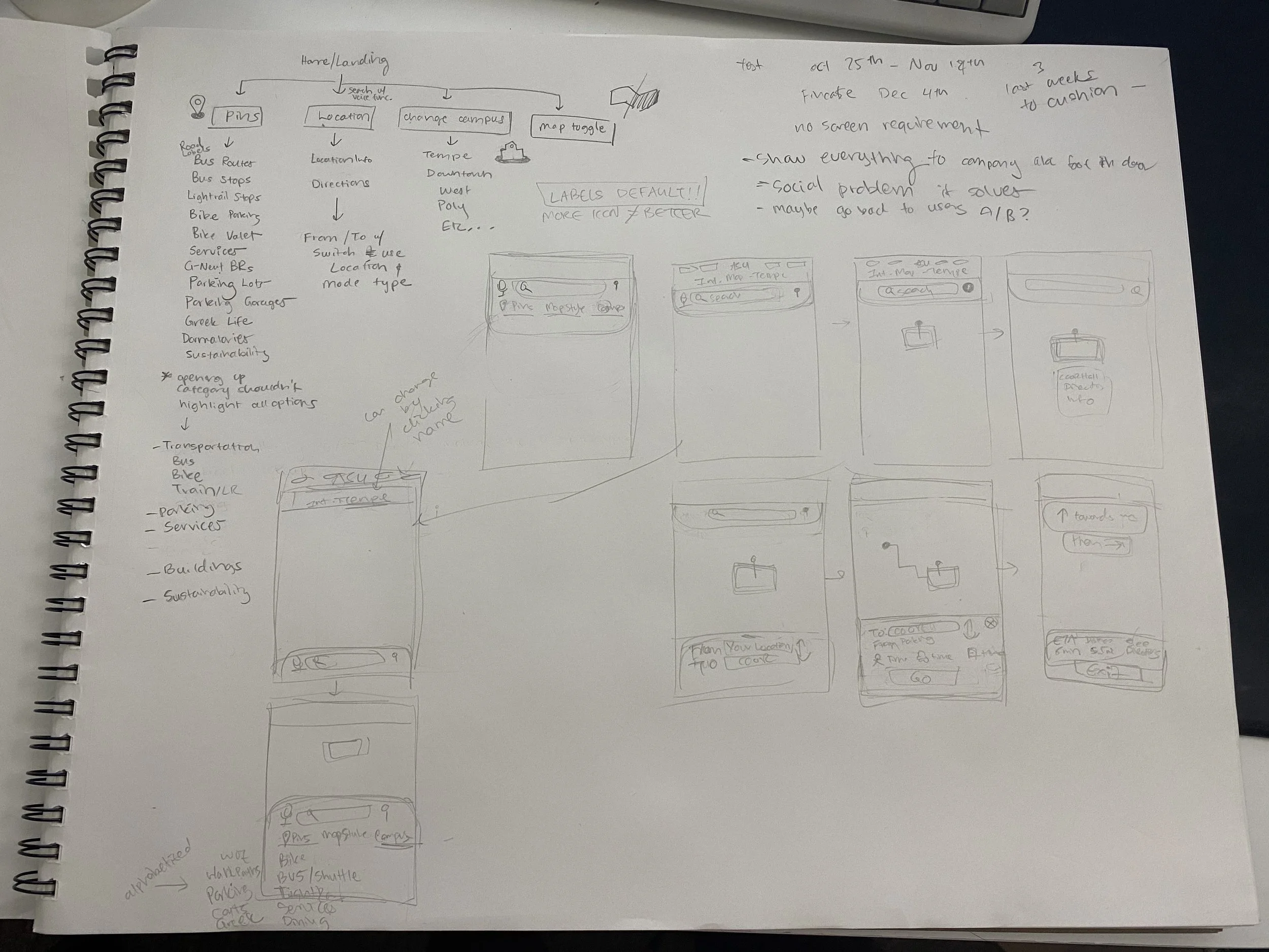

Screens
I spent 1-2 weeks on this phase. At the beginning, I studied other map apps such as Google maps, Apple maps, and Waze to understand what design choices that they have that work well.
Part of its design was also driven by creating some design principles the app to help keep brainstorming for the design focused--ASU IMA needed to be on-the-go friendly, respect the user’s time, understand what the user finds important, and not be overwhelming.

I changed the way these location categories could be selected--before, you had to select the location generic type and its subtype for the subtype to display, even though the subtype could be selected independent of the larger, generic one. In my design, this is eliminated--if a user taps to see “bike valets” they should not have to select “Bike” to enable bike valets to be seen--it's a given that the user is interested in bike information by just tapping on the subtype.
This new format also eliminates the need for a legends tab in the navigation as I designed each subtype to be assigned its own color when selected rather than have its pin appearance be based on the overarching category like the current app does. This makes looking at information within the same categories effortless and saves time having to look elsewhere in the app to aid in understanding the map.
Additionally, the map type toggle and campus map selection are included in the pull up menu, using both words and icons to denote their meaning. The campus being viewed can alternatively be changed by tapping the name of it at the top as well--this redundancy is to help accommodate both those who are familiar with mobile interactions and those who are not.

Finally, I had the bottom sheet expand for a location search result so that it could show the address of a building, its picture in close proximity to the name, and a CTA to get directions instead of having to redirect via extra steps to simply get directions. I also organized any miscellaneous information and building history information under a “learn more” so that users can quickly glean the pop up result for what they need.


In order to see if my designs had any impact on the desired goals, I performed usability testing to see the time it takes to perform a set of given tasks.
Results from 3 participants revealed a dramatic decrease in time to task for almost all tasks, which indicates successful design choices.
One exception was one of the options for changing the campus map, which took a little longer for all 3 participants than the original design.
The biggest takeaways from this phase so far include valuable insights on what changes to make on the design iteration:
All 3 users struggled with the information architecture of the Locations tab within the menu navigation. This indicates a potential need to re-think and organize where this feature is found in the app.
Older users may not be as familiar with gesture control cues, such as rounded menu corners. I realized this can be also applied to the visually impaired. This means I need to provide extra cues like arrows and icons to indicate navigational options.
These two takeaways also alerted me to make the app mobile web browser friendly, where users might not think to use gestures to open menus.
A significant design decision I made was the reduced use of icons in place of text information. ASU’s current IMA attaches icons to almost every piece of information on the landing screen despite many of these not clearly indicating or matching the information it represents. In my design, I supplement the icons with text when possible to avoid any user confusion and cut down on their time to complete a task.
All icons interactive state was indicated by a visual toggle between grey and maroon color when instead of switching pictures and colors.
To close…
ASU’s Interactive Map App suffered greatly in allowing users to use it for its intended purposes--it was able to create an “ok” user experience but not one that users would recommend to their friends, which suggests room for improvement. This meant targeting the way information was presented to users and the app’s navigation system primarily. I worked to simplify the information presented and then more intimately tie their presence in to key user tasks. My solutions proved to be successful in early testing in reducing the frustration and making information access more easily available. These changes made and the planned ongoing design reiteration strive to create a more recommendable app that reflects the quality of the college behind it.